Why Modern Color Schemes Transform Apartment Complex Appeal
Exterior apartment complex modern color schemes can dramatically boost a property's curb appeal and perceived value. According to the National Association of Realtors, updated exterior paint colors can increase perceived value by up to 5%, while a Sherwin-Williams survey found that 70% of potential renters consider exterior appearance when deciding where to live.
Top Modern Color Schemes for Apartment Complexes:
- Dark and Moody: Charcoal, deep navy, or Benjamin Moore's Wrought Iron paired with warm wood accents
- High-Contrast Classic: Crisp white siding with black trim and roofing for timeless appeal
- Biophilic Earth Tones: Sage greens, deep olive, and warm taupe that connect with nature
- Sophisticated Grays: "Greige" blends that offer versatility without the sterile feel of pure white
- Bold Blues: Van Courtland Blue or similar hues for personality and distinction
The multifamily housing market continues growing at 4.5% annually, making strategic exterior design choices more important than ever. Smart color selection goes beyond aesthetics - it creates emotional connections with prospective residents and helps properties stand out in competitive markets.
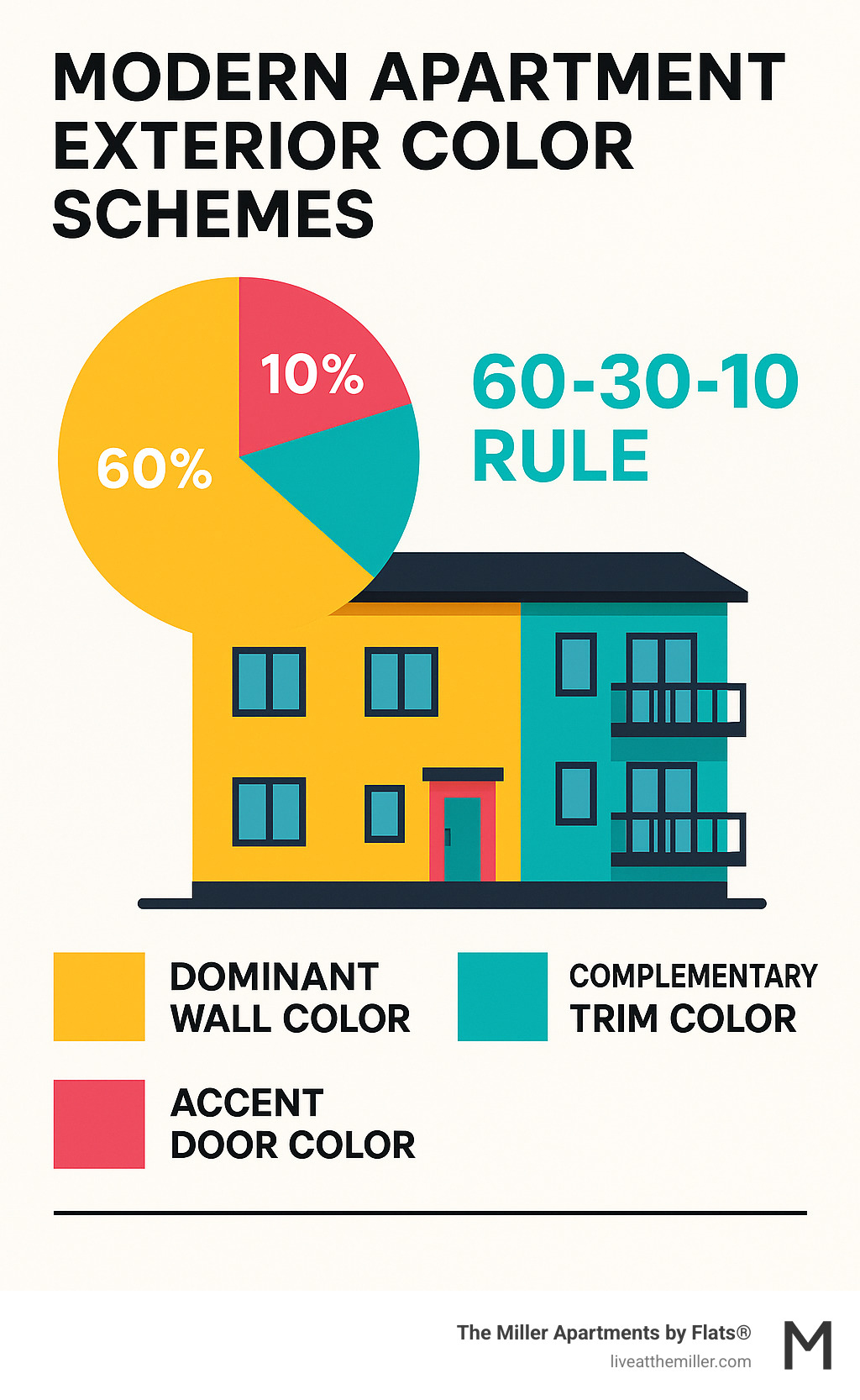
Modern apartment complexes benefit from the 60-30-10 color rule: 60% dominant color, 30% complementary shade, and 10% accent color. This creates visual balance while allowing for architectural interest through strategic color placement on trim, doors, and building features.
Never underestimate first impressions. Exteriors need to make an impact through technology, since most apartment searches now happen online before in-person visits.
Trending Modern Color Palettes That Attract Residents
Today's renters are drawn to apartment complexes that feel fresh, sophisticated, and thoughtfully designed. The right color palette can transform an ordinary building into a place people genuinely want to call home.
Modern exterior apartment complex modern color schemes have evolved far beyond basic beige and builder white. Property managers are finding that strategic color choices create emotional connections with prospective residents before they even step inside. These contemporary palettes blend style with psychology, using color to communicate quality, comfort, and community.
The most successful modern schemes share common traits: they feel intentional rather than accidental, sophisticated rather than flashy, and timeless rather than trendy. Let's explore the three color directions that are currently captivating renters and changing apartment communities.
The Dark and Moody Aesthetic
There's something undeniably luxurious about a building wrapped in deep, dramatic colors. Dark and moody exterior apartment complex modern color schemes are making bold statements across the country, and for good reason.
Benjamin Moore's Wrought Iron leads this trend with its rich charcoal depth. This isn't the flat black of industrial buildings - it's a sophisticated charcoal that shifts subtly in different light. When paired with warm wood accents or natural stone, these deep hues create stunning contrasts that feel both grounded and lifted.
What makes this aesthetic so appealing? Dark colors naturally suggest permanence and quality. They make buildings appear more substantial and established, even when they're brand new. The key lies in the execution - these colors work best when balanced with lighter accents that prevent the overall look from feeling heavy.
This approach aligns beautifully with industrial-inspired design, much like how modern apartment building design ideas incorporate a community's history into contemporary living spaces. The result is sophisticated, memorable, and distinctly modern.
High-Contrast and Timeless
Sometimes the most striking choice is also the most classic. High-contrast color schemes using crisp whites paired with deep darks create visual drama that never goes out of style.
Sherwin-Williams' Alabaster serves as the perfect foundation for this timeless approach. This warm white provides a clean backdrop that makes architectural details pop when paired with charcoal trim, black window frames, or dark roofing materials.
The beauty of high-contrast schemes lies in their clarity. Every line, every architectural feature becomes more defined and intentional. Large apartment buildings can sometimes feel overwhelming, but strategic use of contrasting colors helps break up the mass and create visual interest at a human scale.
This palette works particularly well for complexes that want to feel both contemporary and enduring. White and dark combinations have appealed to people for generations, making them a safe choice for properties planning to attract residents for years to come.
Biophilic and Earthy Tones
As urban living becomes more common, people increasingly crave connections to nature. Biophilic color palettes answer this need by bringing the outdoors in through thoughtful color selection.
Sage greens, deep olives, warm taupes, and natural clay tones are leading this movement. These colors don't just look good - they feel good. They create a sense of calm and connection that busy renters find irresistible.
The Sherwin-Williams' ColorMix Forecast consistently highlights earth-inspired palettes, recognizing their growing appeal in multifamily housing. These colors work especially well in complexes with significant landscaping or natural surroundings, creating seamless transitions between built and natural environments.
Earthy palettes also photograph beautifully - an important consideration when most apartment searches begin online. These colors suggest wellness, sustainability, and thoughtful design, all qualities that resonate with today's renters.
How to Select the Perfect Exterior Apartment Complex Modern Color Schemes
Selecting the right exterior apartment complex modern color schemes is like choosing the perfect outfit for a first date - it needs to look great, feel authentic, and make the right impression. The process goes far beyond picking colors you personally love. You're creating a visual identity that will welcome residents home every day while attracting new ones from the street or online listings.
The decision involves balancing multiple factors that work together like ingredients in a recipe. Architectural style sets the foundation, while regional context adds local flavor. Sustainability considerations ensure your choice ages well, and target demographics help you connect with the right residents.
Here are the essential factors to consider before making your final color selection:
- Architectural Style: Match colors to your building's design language
- Fixed Elements: Work with existing brick, stone, or roofing materials
- Regional Context: Honor local climate and cultural preferences
- Target Demographics: Appeal to your ideal resident profile
- Lighting Conditions: Test how colors look throughout the day
- Sustainability: Choose energy-efficient and long-lasting options
- Cohesion: Create unity across multiple buildings
- Maintenance: Consider how colors will weather over time
Harmonizing with Architectural Styles for Modern Color Schemes
Your building's architecture is like its personality - and the right exterior apartment complex modern color schemes should complement that character, not fight against it. A sleek contemporary complex with floor-to-ceiling windows calls for different colors than a building that celebrates industrial heritage with exposed brick and steel details.
Think of color as a tool that can highlight your building's best features. Clean lines and minimalist forms pair beautifully with cool grays and crisp whites, while industrial-inspired designs can handle bolder choices like deep charcoals or even strategic pops of vibrant color. The key is using color to add scale and definition to architectural elements.
Using color to differentiate architectural elements or individual buildings within a complex helps create variety while maintaining unity. This approach prevents large structures from looking like imposing monoliths. Instead, they feel more detailed and approachable.
Color placement strategy can work wonders for proportion. A darker base color grounds a building and makes it feel substantial, while lighter tones on upper levels can make the structure appear taller and more neat. Strategic accent colors on entrances, balconies, or unique features guide the eye and create visual interest.
For deeper insights into how color choices integrate with overall design concepts, exploring Modern Apartment Building Design Ideas provides valuable context on contemporary architectural approaches.
Considering Regional Context for Your Exterior Apartment Complex Modern Color Schemes
Location matters more than you might think when choosing exterior apartment complex modern color schemes. What looks stunning in sunny California might feel out of place in the Pacific Northwest, and colors that work perfectly in a busy urban setting could seem jarring in a quiet suburban neighborhood.
Regional climate and landscape naturally influence color preferences. In the Pacific Northwest, where lush greens and often overcast skies dominate the scenery, palettes featuring cool grays, deep blues, and natural wood tones feel authentic and harmonious. These choices reflect the natural beauty of the region while creating a sense of calm integration with the environment.
Urban versus suburban settings also demand different approaches. Cities often accept bolder, more distinctive colors that help buildings stand out against concrete and glass backdrops. Younger families particularly appreciate distinctive colors because they want to identify with their home and feel pride in where they live.
Historical context adds another layer of consideration. In areas with strong architectural heritage, colors that nod to traditional styles while maintaining modern sophistication can be both respectful and appealing. All-white schemes in historic areas can read as "too traditional" and fail to engage meaningfully with contemporary living.
The goal is striking the right balance - making your complex stand out positively while ensuring it feels like a natural part of the community. Integrating the building into its environment creates lasting appeal and resident satisfaction.
Sustainability and Energy Efficiency in Color Choice
Modern exterior apartment complex modern color schemes increasingly consider environmental impact alongside visual appeal. Your color choices can actually affect your building's energy performance, making sustainability both responsible and practical.
Light Reflectance Value (LRV) is the technical term for how much sunlight a color reflects versus absorbs. Lighter colors have higher LRV ratings, meaning they bounce more sunlight away and absorb less heat. In warmer climates, this translates to cooler building surfaces and reduced air conditioning costs - a win for both the environment and operating expenses.
Cool-roof technology principles apply to vertical surfaces too. While you might not choose colors based solely on energy efficiency, understanding how your palette affects thermal performance helps you make informed decisions. Darker colors absorb more heat, which could theoretically help with passive heating in colder climates, though this is rarely a primary consideration for large apartment complexes.
Paint durability plays a crucial sustainability role that's often overlooked. High-quality, long-lasting paints reduce repainting frequency, saving resources and reducing waste over time. This long-term thinking aligns perfectly with the growing demand for environmentally responsible living spaces.
Low-VOC (Volatile Organic Compound) paints offer better air quality during application and throughout the paint's lifespan. These formulations support healthier environments for both construction workers and future residents, making them an easy choice for conscientious developers.
By integrating these sustainability considerations, you create apartment complexes that look beautiful while contributing to energy savings and environmental responsibility - exactly what today's environmentally conscious residents are seeking.
Best Practices to Avoid Common Pitfalls
Creating stunning exterior apartment complex modern color schemes goes far beyond choosing pretty colors from a paint deck. The difference between a successful change and a costly mistake often lies in the details—understanding how colors interact with light, ensuring harmony across multiple buildings, and avoiding the pitfalls that can make even expensive paint jobs look amateur.
The most successful apartment complexes take a thoughtful, strategic approach to color selection. They test extensively, consider the bigger picture, and plan for longevity rather than just immediate impact. Let's explore how to get it right the first time.
Creating a Cohesive Look Across a Complex
When you're dealing with multiple buildings, creating cohesive exterior apartment complex modern color schemes becomes both more important and more challenging. Think of it like dressing a large family for a photo—everyone needs to look coordinated without looking identical.
The secret lies in establishing a unified palette that flows throughout the entire property. This doesn't mean painting every building the exact same color (which would be boring anyway). Instead, choose a primary color family and then use accent colors strategically to differentiate individual buildings or highlight architectural features.
For example, you might use a sophisticated charcoal as your main color across all buildings, but vary the trim colors—crisp white on one building, warm wood tones on another, and perhaps a bold blue accent on the third. This approach creates visual interest while maintaining that important sense of community and belonging.
Color can also serve as a practical wayfinding tool. When residents can easily identify their building by its unique accent color or trim, it creates a more user-friendly environment. The Miller Apartments exemplify this thoughtful approach to community design, where each element works together to create a cohesive whole. You can see examples of this harmonious design approach in their gallery.
The Importance of Lighting and Landscaping
Here's something that surprises many people: the same paint color can look completely different depending on when you see it and what's around it. Natural light dramatically impacts how colors appear throughout the day, and ignoring this reality is one of the fastest ways to end up disappointed with your final result.
North-facing walls tend to receive cooler, more indirect light, which can make colors appear darker and more muted. South-facing walls get that warm, direct sunlight that can make colors look brighter and sometimes completely different from what you expected. A color that looks perfect in the paint store might look washed out or overly intense once it's on your building.
The solution? Always test your colors directly on the building at different times of day. Paint large sample areas—not tiny swatches—and observe them in morning light, harsh midday sun, and soft evening glow. Check them on cloudy days too, because that's when many people will see your building.
Landscaping plays a supporting role that's often overlooked. Lush green foliage can make neutral colors pop beautifully, while flowering plants add seasonal color that complements your permanent palette. Even your hardscaping materials—walkways, patios, and outdoor furniture—should work harmoniously with your chosen colors.
Common Mistakes to Avoid
Even with the best intentions, certain mistakes pop up again and again in apartment complex color schemes. Learning to spot and avoid these pitfalls can save you time, money, and frustration.
Ignoring fixed elements is perhaps the biggest mistake. Your building likely has brick, stone, or roofing that isn't going anywhere. These materials have their own undertones—warm or cool, red or gray—and your paint colors need to complement them, not fight them. Start with what you can't change, then build your palette around those existing elements.
Choosing overly trendy colors might seem exciting now, but exterior paint jobs are expensive and time-consuming. That bold coral that's everywhere this year might look dated in three years. Stick with timeless modern schemes that have staying power while still feeling fresh and contemporary.
Poor color combinations happen when people don't understand how colors work together. Mixing warm and cool undertones carelessly can create a muddy, unharmonious look. The colors might look fine individually, but together they just don't sing.
Forgetting about trim and accents is like buying a beautiful dress and forgetting the accessories. Your main color is important, but those trim colors, door colors, and accent details are what give your building personality and polish. They define architectural features and add the visual interest that makes people stop and take notice.
Finally, not testing paint samples properly is the mistake that leads to all the others. Those tiny paint chips in the store are helpful for initial selection, but they can't show you how a color will actually look on your building. Always paint large test areas and live with them for at least a week before making your final decision. Your future self will thank you.
Frequently Asked Questions about Modern Exterior Colors
Choosing the right colors for an apartment complex involves more than just picking what looks nice. Property managers and residents alike have practical questions about how color choices affect everything from property value to maintenance. These common questions help clarify the real-world impact of thoughtful exterior design decisions.
How can color increase an apartment complex's perceived value?
Exterior apartment complex modern color schemes work like a first impression that never gets a second chance. When a building looks fresh, well-maintained, and thoughtfully designed, potential residents immediately assume the same level of care extends to the interior and management.
The numbers back this up. The National Association of Realtors found that updated exterior paint colors can boost perceived value by up to 5%. For apartment complexes, this translates into tangible benefits: higher occupancy rates, reduced vacancy periods, and the ability to attract quality tenants who appreciate attention to detail.
A Sherwin-Williams survey revealed that 70% of potential renters consider exterior appearance when deciding where to live. In today's competitive rental market, that's a significant advantage. A sophisticated color scheme signals that a property offers a quality living experience, not just a place to sleep.
Think about it this way: two similar complexes sit side by side. One features a tired, outdated color scheme that screams "1990s." The other showcases a modern palette of sophisticated grays with warm wood accents. Which one would you choose? The answer seems obvious, and rental rates often reflect that difference.
What is the best way to test exterior paint colors?
Testing exterior apartment complex modern color schemes requires patience, but it's absolutely worth the effort. Small paint chips from the hardware store lie to you - they simply can't show how a color will actually look on a large building surface.
The only reliable method involves painting large sample areas directly on the building itself, or creating substantial sample boards that can be moved around the property. We're talking about sections at least 2 feet by 2 feet, not tiny swatches.
Here's the crucial part: observe these samples throughout an entire day cycle. Morning light, noon sun, and evening shadows all tell different stories about the same color. A gray that looks perfect at midday might appear purple-ish in the evening or too stark in morning light.
Weather conditions matter too. That sage green might look sophisticated on a sunny day but muddy under overcast skies. Since the Pacific Northwest sees its share of cloudy days, this step becomes even more important for properties in areas like Vancouver, WA.
It is often recommended to live with test colors for at least a week, checking them during different weather patterns. It might seem excessive, but it's far less expensive than repainting an entire complex because the color didn't work as expected.
How do you choose colors for a building with mixed materials like brick and siding?
Buildings with mixed materials like brick, stone, and siding present a special challenge for exterior apartment complex modern color schemes. The secret lies in working with what you can't change, rather than fighting against it.
Start by studying the fixed elements - the brick, stone, or existing roofing materials. These unchangeable features have undertones that will either harmonize or clash with your paint choices. Brick might lean warm with orange or red hints, or cool with gray undertones. Stone can range from creamy beiges to cool charcoals.
Pull your color inspiration directly from these existing materials. If your brick has warm undertones, choose paint colors that share that warmth - think warm grays, creams, or even deep greens with yellow bases. Cool brick pairs beautifully with cool-toned paints like true grays, blues, or charcoals.
The goal isn't to match exactly, but to create a conversation between materials rather than an argument. A successful scheme makes the building look intentional and cohesive, as if the architect planned every element to work together from the beginning.
Many successful complexes use this approach to highlight their architectural character. The Miller Apartments, for example, blend modern design with Vancouver's industrial history, creating a sophisticated look that honors both past and present through thoughtful material coordination.
Conclusion
Choosing the right exterior apartment complex modern color schemes goes far beyond picking pretty colors-it's about creating a home that people genuinely want to call their own. This guide has explored how sophisticated grays, bold blues, dramatic dark palettes, and nature-inspired earth tones are reshaping the way apartment complexes connect with residents.
The magic happens when you blend current trends with smart decision-making. Your architectural style sets the foundation, while regional context ensures your building feels like it belongs in its neighborhood. Don't forget about sustainability factors-they're becoming increasingly important to residents who care about their environmental impact.
The best color schemes tell a story. They create visual harmony across multiple buildings while still allowing each structure to have its own personality. They work beautifully with landscaping and change gracefully throughout the day as natural light shifts. Most importantly, they avoid the common pitfalls that can make a building look dated or out of place within just a few years.
A thoughtful color strategy does more than improve curb appeal-it transforms the entire resident experience. When people drive up to a beautifully designed complex, they immediately sense the care and attention that went into creating their potential home. This emotional connection translates into higher perceived value and stronger community pride.
The Miller Apartments perfectly demonstrate this philosophy in action. Located in Vancouver's vibrant Waterfront neighborhood, they've masterfully blended modern design elements with nods to the city's rich industrial heritage. The result is a living environment that feels both contemporary and rooted in place-exactly what today's residents are seeking.
Creating exceptional living spaces requires attention to every detail, from the exterior palette to the interior amenities. See how thoughtful design principles create truly outstanding apartment living. Explore luxury apartments in Vancouver WA and experience the difference that intentional design makes.


